Are you confused about the subtle distinctions between beige and cream? Don’t worry, we’ve got you covered. In this article, we’ll explain the key differences between these two popular colors. From their color composition to undertones and hues, we’ll break it all down for you. We’ll also explore how these colors are used in interior design and fashion. By the end, you’ll have a clear understanding of beige and cream and be able to confidently choose the right paint color for your needs.
Color Composition
Understanding the color composition of beige and cream can help you distinguish between the two shades with greater accuracy. Color psychology plays a significant role in how we perceive and interpret colors. Beige is often described as a warm color that evokes a sense of calmness and relaxation. It is a neutral color with undertones of yellow, gray, or brown. Cream, on the other hand, is a lighter shade of beige and is often associated with purity and simplicity. It is a warm and soothing color that can create a sense of tranquility.
Cultural associations also play a role in how beige and cream are perceived. In Western cultures, beige is often associated with elegance, luxury, and sophistication. It is commonly used in interior design to create a timeless and refined look. Cream, on the other hand, is often associated with purity, innocence, and simplicity. It is commonly used in weddings and other formal occasions to create a soft and romantic atmosphere.
Understanding the color composition of beige and cream can help you make more informed choices when it comes to interior design, fashion, and other creative endeavors. Whether you prefer the warmth of beige or the simplicity of cream, knowing the subtle differences between these two shades can enhance your ability to convey the desired mood and message in your chosen medium.
Undertones and Hues
To further distinguish between beige and cream, it is important to consider their undertones and hues. Undertones refer to the subtle colors that are present within a shade, while hues refer to the overall color of the shade itself. Understanding the undertones and hues of beige and cream can help you make informed decisions when choosing colors for your home or wardrobe. Here are four key points to consider:
- Undertones: Beige often has warm undertones, leaning towards yellow or brown. Cream, on the other hand, can have cool undertones, leaning towards white or gray. These undertones affect the overall color temperature of the shade.
- Color Temperature: Warm undertones in beige can create a cozy and inviting atmosphere, while cool undertones in cream can evoke a sense of freshness and calmness.
- Hues: Beige is a neutral color that falls between white and brown, while cream is a lighter version of yellowish-white. Beige tends to have a more earthy and natural feel, while cream has a softer and more delicate appearance.
- Color Psychology: Beige is often associated with reliability, simplicity, and warmth. Cream, on the other hand, is associated with purity, elegance, and serenity.
Light Reflectivity
When it comes to light reflectivity, the differences between beige and cream can have a significant impact on your visual perception and the overall ambiance of a space. Beige tends to reflect more light, giving a brighter and more open feel to a room. On the other hand, cream has a softer reflectivity, creating a cozy and warm atmosphere. Understanding these distinctions can help you make informed decisions when choosing between beige and cream for your interior design.
Visual Perception Differences
Your perception of the difference in light reflectivity between beige and cream can be influenced by various factors. Here are four key aspects to consider:
- Color Psychology: Beige and cream both fall under the neutral color category, but their undertones can create different visual effects. Beige, with its warm yellow or brown undertones, tends to reflect more light and create a cozy, inviting ambiance. On the other hand, cream, with its cooler white or ivory undertones, reflects less light and gives a cleaner, more sophisticated feel.
- Cultural Associations: Cultural backgrounds and personal experiences play a role in how we perceive colors. For example, in some cultures, beige is associated with earthiness and natural elements, while cream is often linked to elegance and purity.
- Lighting Conditions: The lighting in a space can significantly affect the perceived light reflectivity of beige and cream. Natural light tends to enhance the warmth of beige, while artificial lighting can bring out the coolness of cream.
- Surrounding Colors: The colors and textures of the surroundings can alter our perception of beige and cream. Beige may appear warmer when paired with earthy tones, while cream can look crisper when combined with brighter hues.
Understanding these factors can help you make informed decisions when choosing between beige and cream, ensuring that the desired visual perception is achieved in your space.
Impact on Ambiance
The impact of light reflectivity on the ambiance can vary between beige and cream. Both colors have different psychological effects and cultural associations, which contribute to their unique impact on a space. Beige, with its warm undertones, tends to create a cozy and inviting atmosphere. Its light reflectivity can make a room feel brighter, especially when paired with natural light. Cream, on the other hand, has cooler undertones and a more serene vibe. It reflects light in a softer way, creating a calming and peaceful ambiance. Cream is often associated with elegance and sophistication, making it a popular choice in formal settings. Understanding the light reflectivity of beige and cream can help you choose the right color to create the desired ambiance in your space.
Popularity in Interior Design
In interior design, beige and cream have gained popularity over the years for their timeless and versatile appeal. These neutral colors have become go-to choices for many homeowners and designers due to their ability to create a sense of warmth and sophistication in any space. Here are some reasons why beige and cream have become so popular in interior design:
- Popularity trends: Beige and cream have become popular choices in interior design due to the current trend of creating minimalist and neutral spaces. These colors provide a clean and calming aesthetic that appeals to many people seeking a sense of tranquility in their homes.
- Psychological effects: Beige and cream are known for their ability to create a sense of relaxation and serenity in a room. These colors have a soothing effect on the mind, making them ideal for spaces where you want to unwind and destress.
- Versatility: Beige and cream are incredibly versatile colors that can be paired with various accent colors and design styles. Whether you prefer a modern, traditional, or eclectic aesthetic, beige and cream serve as a neutral backdrop that allows other elements in the room to shine.
- Timelessness: Unlike trendy colors that may go out of style quickly, beige and cream have stood the test of time. These colors have a classic appeal that can withstand changing design trends, making them a safe and reliable choice for long-term interior design.
Fashion and Textile Applications
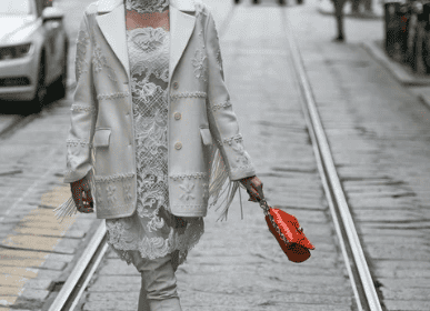
When it comes to fashion and textiles, beige and cream offer a wide range of applications and possibilities. These neutral colors have become staples in the fashion industry due to their versatility and timeless appeal. Whether you’re looking to create a classic, elegant look or a more contemporary and minimalistic style, beige and cream fabrics can help you achieve your desired aesthetic.
In terms of fashion trends, beige and cream have been popular choices for both casual and formal wear. They can be used as the main color or as accents to add depth and sophistication to an outfit. From dresses to suits, these colors can be effortlessly incorporated into any wardrobe.
Additionally, beige and cream fabrics can be dyed using various techniques to create unique patterns and textures. Fabric dyeing techniques such as tie-dye, ombre, and batik can be used to transform plain beige or cream fabrics into vibrant and eye-catching pieces. This allows for endless creativity and customization in fashion design.
To give you a visual representation, here is a table showcasing some fashion and textile applications of beige and cream:
| Fashion Application | Textile Application |
|---|---|
| Beige blazer | Cream upholstery |
| Cream sweater | Beige curtains |
| Beige trousers | Cream tablecloth |
Choosing the Right Paint Color
Selecting the perfect paint color for your space can be a daunting task, but understanding the nuances between beige and cream can help you make the right choice. When choosing a paint color, it’s important to consider the psychological effects and historical significance associated with each option. Here are four key factors to consider when deciding between beige and cream:
- Psychological effects: Beige is often associated with neutrality and calmness, making it a great choice for creating a soothing atmosphere in bedrooms or living rooms. On the other hand, cream tends to evoke a sense of warmth and coziness, making it an ideal option for creating a welcoming ambiance in dining areas or kitchens.
- Historical significance: Beige has been a popular choice in interior design for centuries, often used to create a timeless and elegant look. Cream, on the other hand, has a more traditional feel and is often associated with classic and vintage styles.
- Light reflection: Beige tends to reflect more light than cream, making it a good option for rooms with limited natural light. Cream, on the other hand, absorbs more light, creating a more intimate and cozy atmosphere.
- Versatility: Both beige and cream are versatile colors that can be easily paired with a wide range of other colors, allowing you to create different moods and styles in your space.